In this guest post, Ben Byram-Wigfield tells the story behind the creation of the Splentino typeface, which is included with Dorico 6.
The Plantin typeface was designed in 1913 by the Monotype Drawing Office, near Redhill in the UK, under the direction of Frank Pierpont and Fritz Stelzer. Pierpont had visited the Plantin-Moretus Museum in Antwerp (a great day out, if you’re in the area), and came back with photographs, documents and ideas for a typeface based on the 16th-century type by Robert Granjon that he had seen there. Additional styles and weights were produced in the inter-war years: Bold in 1927, then Bold Condensed, SemiBold, Light, and finally Titling in 1936. For many years, Plantin was one of the bestselling types in the UK and further afield.
Plantin was widely used in many publishing houses, including the University Presses of Cambridge and Oxford. The typeface has become strongly associated with OUP’s music publications, and the font was bundled with early versions of Sibelius notation software.
However, on a page of music, I have never particularly liked this typeface, finding the proportions too wide. Two things happened recently, which led me to question this. First, I read a book on type that outlined Plantin’s history, and praised it for its economy of space. At the same time, I was handed a score, printed in the 1960s, that was clearly set in Plantin, but the proportions looked much better. So I started doing a little research.
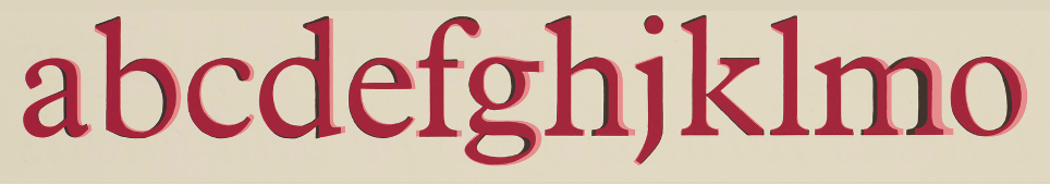
It became evident that the digital version of Plantin that you buy today is not the same as the old, pre-digital design, known as ‘Plantin 110’. The uppercase letters in the digital version are on average 11% wider! In these images, Monotype’s Plantin in metal type is shown in black, with the digital version overlaid in red. Look at the M!
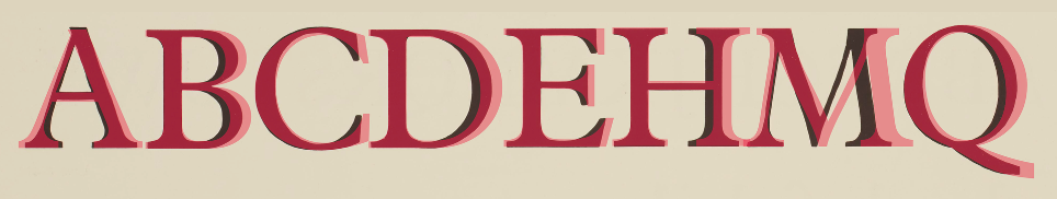
This stretching can also be seen to varying degrees in the lowercase, as well as the Bold and Italic. Some letters, particularly M and m, are considerably stretched.
For music engraving, increasing the width and spacing of lyric text has a significant effect on the spacing of notes, which must be moved apart to accommodate the wider text. Economy of space is also important for other text components, like expression marks between the staves of a piano part.
It was this additional wideness, which spoils the proportions of the type, that I had found somewhat jarring. I decided to see if I could make a digital typeface that was closer to the original design, in terms of proportion and spacing.
Method
I managed to track down a variety of reference material for the design. As luck would have it, I live near the UK’s Science Museum, which holds the archive of the Monotype Drawing Office, including matrices, metal type and specimen sheets. I also obtained some Letraset dry transfer sheets and printed pages. These provided examples that could be traced or studied as the starting point for the design.
Make a resolution
If you’re scanning material for a typeface, you need sufficient resolution. Font design apps usually work to a coordinate system of 1000 units, known as UPMs, or units per Em. (An Em being the point-size of the font.) So, if you want 1 pixel in your scan to be 1 UPM, then you’d need to scan 24pt type at 3000 dpi. Of course, this is far beyond the available detail in the material. So, inevitably, when drawing your curves, you have to pin the tail on the donkey and guess where the nodes connect.
The reverse is true when you print your font: if you print 12pt type to a 600-dpi laser printer, then you get 10 UPM for each toner dot. So, any detail in your design within a 10-by-10 square will be a rounding error on your print-out. Only at 120pt would you get one toner dot for every UPM. And none of this takes any account of the limits of human eyes, which can’t resolve 300-dpi dots at a distance of more than 50 years old…
Creating the shapes
Given the varying nature of the sources, I wanted to create a consistent and coherent design, rather than merely copying instances verbatim. So the traced outlines would only be the foundation: the stems, counters, serifs and other characteristics would follow a consistent design. The first lesson of font design is: don’t start with the letter A! Start with uppercase letters I and O. The I provides a basis for all vertical strokes and serifs, and the O provides curves and a standard width. Next, make the letter H (using two letter Is). Then E, F, L and T follow easily enough. O gives you C, G and Q. Then you can create the letters that mix curves and lines: D, B, P, R.
V is a new shape, which informs the letters W, Y, X and K, as well as A (upside down), M and N. Then you’re left with a few stragglers. S is the most difficult, and best left till last.
Start again with the lowercase l and o, applying a similar method; though there is slightly less conformity in lowercase. And after that, you just have to do the numbers, punctuation, accented versions, small caps, and all the other symbols. And then do it all again for each style!
Balancing the design
Of course, having said that the whole thing builds itself from a few key components, if you look at most type designs, you’ll see that the curve on a C isn’t exactly the same curve as an O; and an F isn’t exactly an E with a missing leg. Not all the vertical strokes are the same width, either. Ironically, to make the design look balanced and consistent, you have to adjust the lines and curves to be slightly different. Famously, the columns of the Parthenon only look perfectly straight because they are slightly curved. Similar effects must be wrought in font design. Circles must be slightly stretched vertically to look like perfect circles. They must also be a bit larger than rectangular objects. There is also the Poggendorff illusion, which affects the lines of an X. And so on…
Spacing the letters
Having got your shapes, you then have to add margins on both side of each letter, so that they sit beside each other in a consistent and even way. Different letters need different margins. But of course, different pairs of letters have more space around them than others, so you have to make individual spacing adjustments for those pairs. (A classic example is AWAY, where the letters are adjusted to overlap each other.)
Departures from the source
Several changes from the original design have been made to improve consistency, and to give a better balance with other letters. The counters (enclosed circles) of b, d, p and q have been made consistent, in their various orientations. The counters of a, e and g have been enlarged for greater legibility. Type historians have pointed out that the letter a which Pierpont saw in the museum was an 18th-century replacement, rather than a 16th-century one. A slight chamfer (diagonal cut) has been added to the left-hand top of lowercase vertical stems. The serifs and pedestals have been standardized. The crossbar of H has been raised. Other standardizations and adjustments have been made throughout the process.
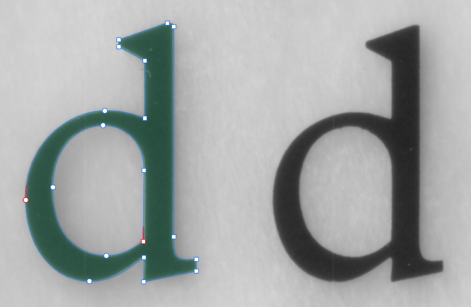
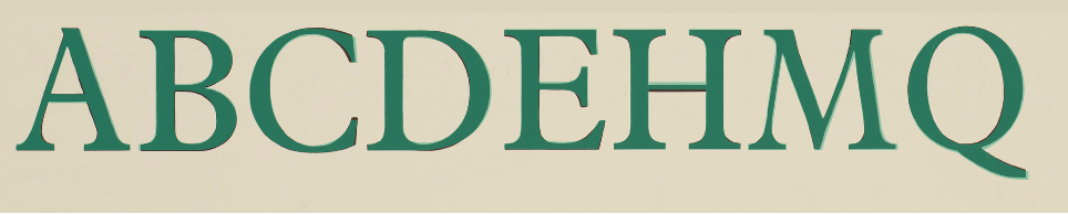
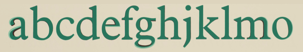
The result
These images show Splentino in green, laid on top of the original Monotype metal type in black:
This design will have its own flaws and foibles, of course. There are always improvements that can be made to kerning….
What have you done?
Digital versions of Plantin have been produced by several companies, notably during the pioneer period of font production in the early 1990s, when existing designs were digitized wholesale, often through automated processes that produced poor results. There is an open-source project based on Plantin on Github, called Libre Moretus, though incomplete and seemingly abandoned since 2016. The Klim Type Foundry produced a typeface named Martina Plantijn, after Plantin’s daughter, which they describe as ‘a better Plantin’. Many other typefaces have taken ‘inspiration’, at the very least, from Plantin in their design. Stanley Morrison famously based Times on Plantin, leading Allan Haley to describe it as ‘Plantin on a diet’.
Fonts based on classic designs are variously described as ‘revivals’, ‘clones’, or ‘knock-offs’ — depending on the perceived skill and intent of the creator and the acrimony of the speaker. I hope to have exercised some degree of skill, creativity and judgment to make Splentino a novel and identifiably individual design, rather than merely aping the source material. I have chosen and set the vertical and horizontal metrics of the font; the exact form of the serifs, pedestals and terminals; the stem widths; the angle of the italics; and much more. At the very least, Splentino is clearly distinct from the current digital representation of Plantin, in proportions, metrics, and the details of the design.
What’s in a name?
‘Plantin’ remains a registered trademark of Monotype Imaging, Inc. Some foundries try to use a name for their digital fonts that is redolent of the trademarked name —Planet, Placid, Platus, even Plantain. But in 1995, a US court ruled that URW++ could not name its similar fonts with the same first three letters as those of Monotype’s trademarked versions.
And so I came up with the name Splentino, as a name that I hope is vaguely reminiscent of the original, while also being evocative of nothing in particular.
Other styles and weights
In traditional typesetting, type designers would adjust the design, depending on the size. Larger sizes can show more detail, with proportionally thinner strokes and smaller counters; while smaller sizes need to have bigger gaps and heavier strokes, to increase legibility. Today, some digital fonts are available in ‘Optical sizes’, which offer similar variations for a range of sizes.
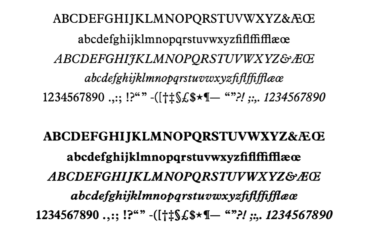
I have completed the four standard styles of Regular, Italic, Bold and Bold Italic. The metal type also had Light, Light Italic, Bold Condensed, SemiBold, SemiBold Italic, and a cut made for Titling. I do not intend to create Light weights: Those were mechanical adaptations of the original designs, created for the needs of traditional printing technologies. However, there may be something further in the pipeline.
The real test is on a page of music, of course.
Splentino is included with all versions of Dorico 6 on macOS, Windows, and iPadOS. To try Dorico for yourself, please visit our web site to download a free trial.
The photograph of metal type for Plantin Italic at the top of this post is courtesy of the Science Museum, London, UK.
Very nice font !!! I’ve already adopted it in several projects.
Beautiful font. Thank you.
Beautiful font. Thank you.
Thanks for this – very interesting. As I’ve posted elsewhere, Splentino is a fabulous addition to Dorico and very much one of my go to fonts now. Clean and stylish and very, very elegant. A shame about Light Weights – I reach for those all the time, particularly on things like bar numbers, instrument cues etc. – but these are just choices and there are near-fit alternatives.
Dear Ben, thanks for your great work, the Dorico community is lucky to have such a talented and hard-working person as you!
Splentino has a timeless, elegant look and high readability. It saves space not only horizontally, but also vertically(!). For me, it is looking to become a top choice!
I’m happy to hear that you appear to be working on something further – Bold Condensed would be a dream for tempo markings, which always take too much horizontal space! Semi Bold is always a nice option for a heavier appearance. And a Titling cut would be the icing on the cake!
Best wishes for your future endeavors!
Having another typeface (text or music) in the Dorico “tool box” is always welcome, of course. Two questions, though:
1. Is this typeface available for use on a standalone basis, or only to those who have licensed the new Dorico?
2. Is it usable in other applications after Dorico is installed?
The typeface is currently only available by installing Dorico. You can of course use it any application.
Such a beautiful font! Can’t wait to use this.
I’d love to see more gorgeous fonts like this in future releases of Dorico – there are excellent free fonts such as Antykwa Półtawskiego that could be bundled, and no doubt lots more that I haven’t come across yet.
Hello Ben, congratulations on your work with this font, which I already used for a few projects. The notation community is lucky to have such a creative and hard-working person!
Splentino has an elegant and versatile look to me, and is very readable. It saves space not only horizontally, but also vertically!
A Semi-Bold weight would be perfect for smaller sizes and a more substantial look. A Bold-Condensed cut I would love for tempo text, which tends to take too much horizontal space with most fonts, especially in parts which have a lot of rests (typical example: https://s9.imslp.org/files/imglnks/usimg/8/83/IMSLP961532-PMLP58739-ilovepdf_merged-135-137.pdf).
A Titling style would of course be the icing on the cake.
Thank you for your great work, and I wish you all the best!
Thank you for this excellent work! I’ve always liked the OUP look. I frequently sent hymntunes/texts, and I’ve noticed that the number 1 does not appear to be built for monospacing, and therefore does not center correctly with other verse numbers below it. I’ve asked for help with this in the Facebook group, but would love to know if an update to this particular character is in the works.
Just wanted to chime in and say that this font is *spectacular*. I’ve always loved Plantin; it’s the default Tolkien typeface, so it’s been burned into my brain forever. This solves so many little issues with the digital versions, and it’s so immensely readable, I’ve started using it on my Kindle and as my default typeface on Word.
I hope you expand the font family and make it widely available, even apart from Dorico, because I’m sure plenty of non-musical font fans would love it!